Stephen Shore. The nature of photographs
In The Nature of Photographs, Stephen Shore explores ways of understanding and looking at all types of photographs- from iconic images to found pictures, negatives to digital files. Based on Shore’s many years of teaching photography at Bard College, New York State, this book serves as an indispensable tool for students, teachers and everyone who wants to take better pictures or learn to look at them in a more informed way.
As well as a selection of Shore’s own work, The Nature of Photographs contains images from throughout the history of photography, from works by the fathers of photography such as Alfred Stieglitz and Walker Evans to that of artists working with the medium today such as Collier Schorr and Thomas Struth. It covers a range of genres, such as street photography, fine art photography and documentary photography, as well as images by unknown photographers, be they in the form of an old snapshot or an aerial photograph taken as part of a geographical survey. Together with his clear, intelligent and accessible text, Shore uses these works to demonstrate how the world in front of the camera is transformed into a photograph.
The Nature of Photographs
How is this photograph different from the actual scene that Robert Frank saw as he stood in his Butte hotel room and looked out on this depressed mining town in the northern Rockies? How much of this image is a product of lenses, shutters, and media? What are the characteristics of photography that establish how an image looks?
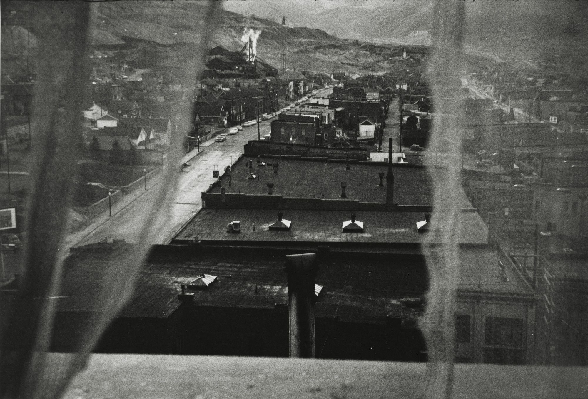
This book explores ways of understanding the nature of photographs; that is, how photographs function; and not only the most elegant or graceful photographs, but all photographs made with a camera and printed directly from the negative or a digital file. All photographic prints have qualities in common. These qualities determine how the world in front of the camera is transformed into a photograph; they also form the visual grammar that elucidates the photograph’s meaning.
A photograph can be viewed on several levels. To begin with, it is a physical object, a print. On this print is an image, an illusion of a window on to the world. It is on this level that we usually read a picture and discover its content: a souvenir of an exotic land, the face of a lover, a wet rock, a landscape at night. Embedded in this level is another that contains signals to our mind’s perceptual apparatus. It gives ’spin’ to what the image depicts and how it is organized.
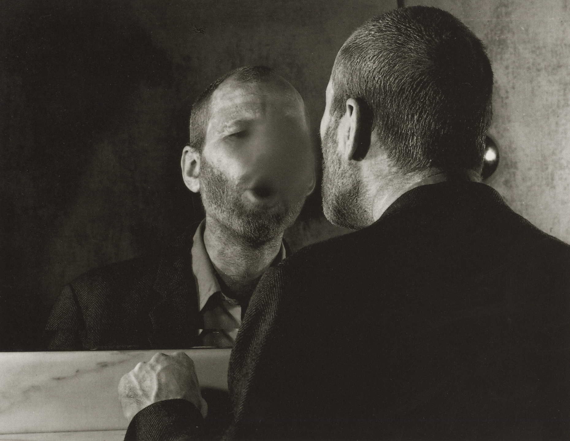
The aim of this book then is not to explore photographic content, but to describe physical and formal attributes of a photographic print that form the tools a photographer uses to define and interpret that content.
The Physical Level
A photographic print is, in most instances, a base of paper, plastic, or metal that has been coated with an emulsion of light-sensitive metallic salts or metallic salts coupled with vegetable or metallic dyes. In some prints, the base is coated directly with or imprinted with dyes, pigments, or carbon. A photograph is flat, it has edges, and it is static; it doesn’t move. While it is flat, it is not a true plane. The print has a physical dimension.
These physical and chemical attributes form the boundaries that circumscribe the nature of the photograph. These attributes impress themselves upon the photographic image. The physical qualities of the print determine some of the visual qualities of the image. The flatness of the photographic paper establishes the plane of the picture. The edges of the print demand the boundedness of the picture. The staticness of the image determines the experience. of time in the photograph. Even the image of a photograph on a computer monitor is flat, static, and bounded. The type of black-and-white emulsion determines the hue and tonal range of the print. The type of base determines the texture of the print.
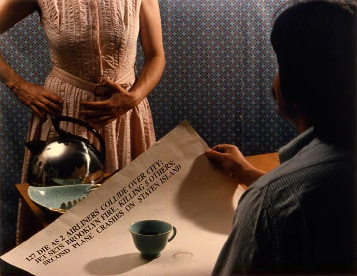
Colour expands a photograph’s palette and adds a new level of descriptive information and transparency to the image. It is more transparent because one is stopped less by the surface — colour is more like how we see. It has added description because it shows the colour of light and the colours of a culture or an age. While made in the 1980s, the palette of this image by Anne Turyn seems to date the picture a generation earlier.
The tonal range of a black-and-white print is affected by the type of emulsion the print is made with. The composition of the film emulsion, the chemistry of the film and print developers, and the nature of the light source from which the print was made also determine the way shadows, midtones, and highlights are described by the print; they determine how many shades of grey the print contains and whether these tones are compressed or separated.
This reproduction of a print by Richard Benson has an exceptionally long tonal scale with subtle, clear, beautiful separation of the low values. The original print is acrylic paint applied to aluminium. It was produced from eight halftone separations made from the original negative.

As an object, a photograph has its own life in the world. It can be saved in a shoebox or in a museum. It can be reproduced as information or as an advertisement. It can be bought and sold. It may be regarded as a utilitarian object or as a work of art. The context in which a photograph is seen effects the meanings a viewer draws from it.
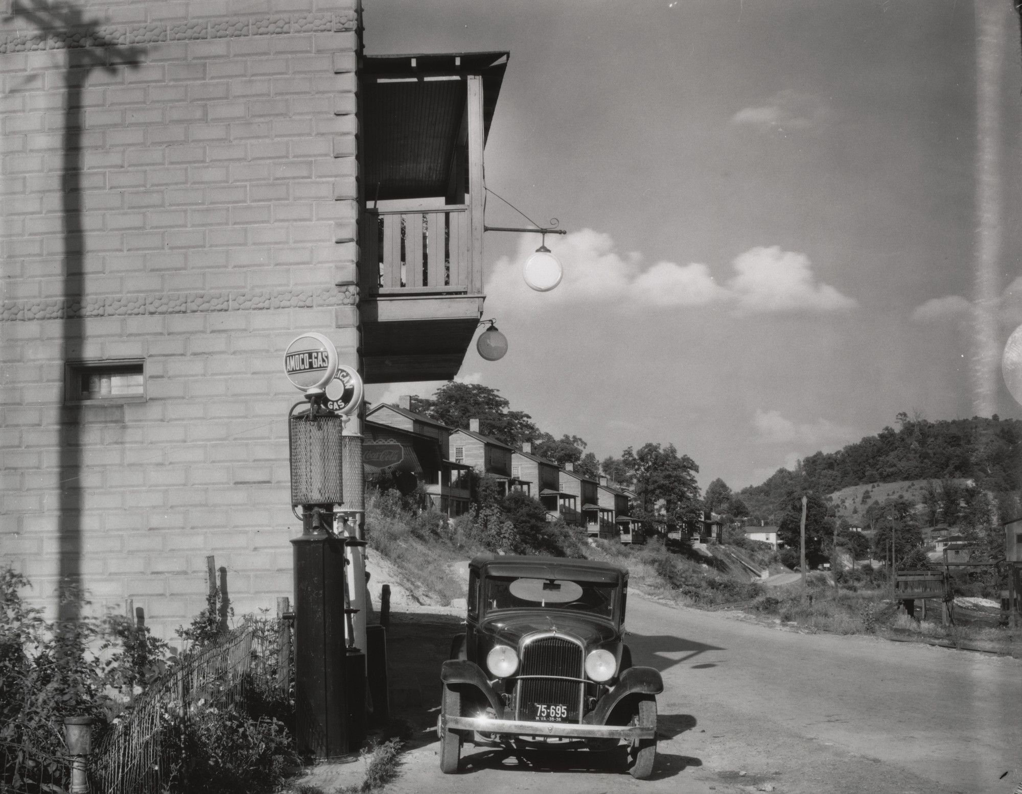
By consciously adopting a visual style, a photographer can reference this context and bring these meanings to the reading of the image, as Walker Evans did when he made this photograph in, what he called, ’documentary style’.

The Depictive Level
Photography is inherently an analytic discipline. Where a painter starts with a blank canvas and builds a picture, a photographer starts with the messiness of the world and selects a picture. A photographer standing before houses and streets and people and trees and artifacts of a culture imposes an order on the scene simplifies the jumble by giving it structure. He or she imposes this order by choosing a vantage point, choosing a frame, choosing a moment of exposure, and by selecting a plane of focus.
The photographic image depicts, within certain formal constraints, an aspect of the world. This photograph by Evans depicts a store, gas pumps, a car, a road, hills and houses, sky. It also depicts receding space.
The formal character of the image is a result of a range of physical and optical factors. These are the factors that define the physical level of the photograph. But on the depictive level there are four central ways in which the world in front of the camera is transformed into the photograph: flatness, frame, time, and focus.
These four attributes define the picture’s depictive content and structure. They form the basis of a photograph’s visual grammar. They are responsible for a snapshooter’s ’mistakes’: a blur, a beheading, a jumble, an awkward moment. They are the means by which photographers express their sense of the world, give structure to their perceptions and articulation to their meanings.
The first means of transformation is flatness. The world is three- dimensional; a photographic image is two-dimensional. Because of this flatness, the depth of depictive space always bears a relationship to the pieture plane. The picture plane is a field upon which the lens’s image is projected. A photographic image can rest on this picture plane and, at the same time, contain an illusion of deep space.
Photographs have (with the exception of stereo pictures) monocular vision — one definite vantage point. They do not have the depth perception that our binocular vision affords us. When three-dimensional space is projected monocularly on to a plane, relationships are created that did not exist before the picture was taken. Things in the back of the picture are brought into juxtaposition with things in the front. Any change in the vantage point results in a change in the relationships. Anyone who has closed one eye, held a finger in front of his or her face, and then switched eyes knows that even this two-inch change in vantage point can produce a dramatic difference in visual relationships.
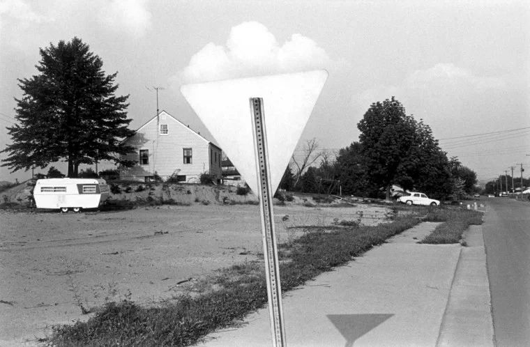
To say that new relationships are created does not mean that the yield sign and cloud in this photograph by Lee Friedlander were not there in front of the camera, but that the visual relationship between them, the cloud sitting like cotton candy on top of the sign, is a product of photographic vision.
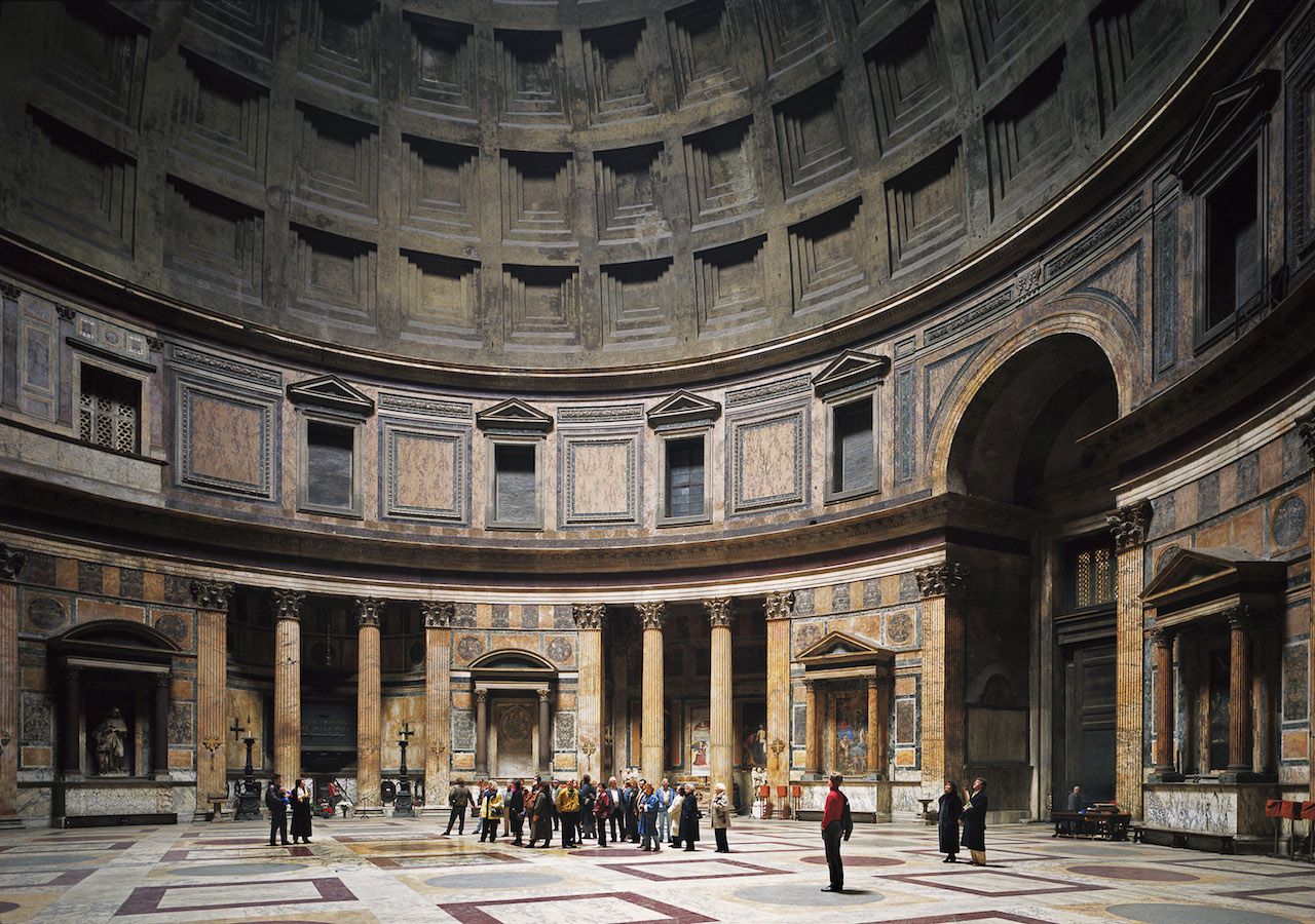
Some photographs are opaque. The viewer is stopped by the picture plane.

Some photographs are transparent. The viewer is drawn through the surface into the illusion of the image.
In the field, outside the controlled confines of a studio, a photographer is confronted with a complex web of visual juxtapositions that realign themselves with each step the photographer takes. Take one step and something hidden comes into view; take another and an object in the front now presses up against one in the distance. Take one step and the description of deep space is clarified; take another and it is obscured.
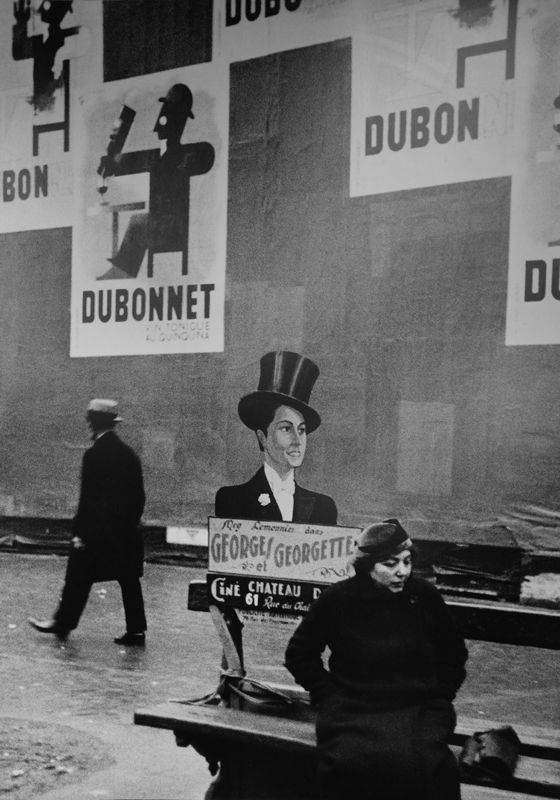
In bringing order to this situation, picture, a photographer solves a more than composes one.
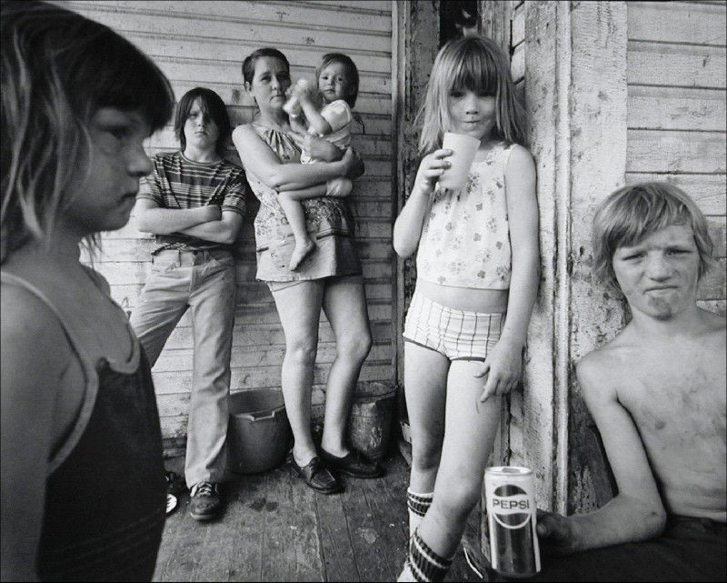
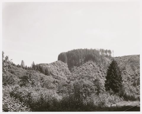
The next transformative element is the frame. A photograph has edges; the world does not. The edges separate what is in the picture from what is not. Robert Adams could aim his camera down a little bit and to the right, include a railroad track in this photograph of a partially clear-cut Western landscape, and send a chilling reverberation through the image’s content and meaning.
The frame corrals the content of the photograph all at once. The objects, people, events, or forms that are in the forefront of a photographer’s attention when making the fine framing decisions are the recipients of the frame’s emphasis. The frame resonates off them and, in turn, draws the viewer’s attention to them.
Just as monocular vision creates juxtapositions of lines and shapes within the image, edges create relationships between these lines and shapes and the frame. The relationships that the edges create are both visual and ’contentual’.
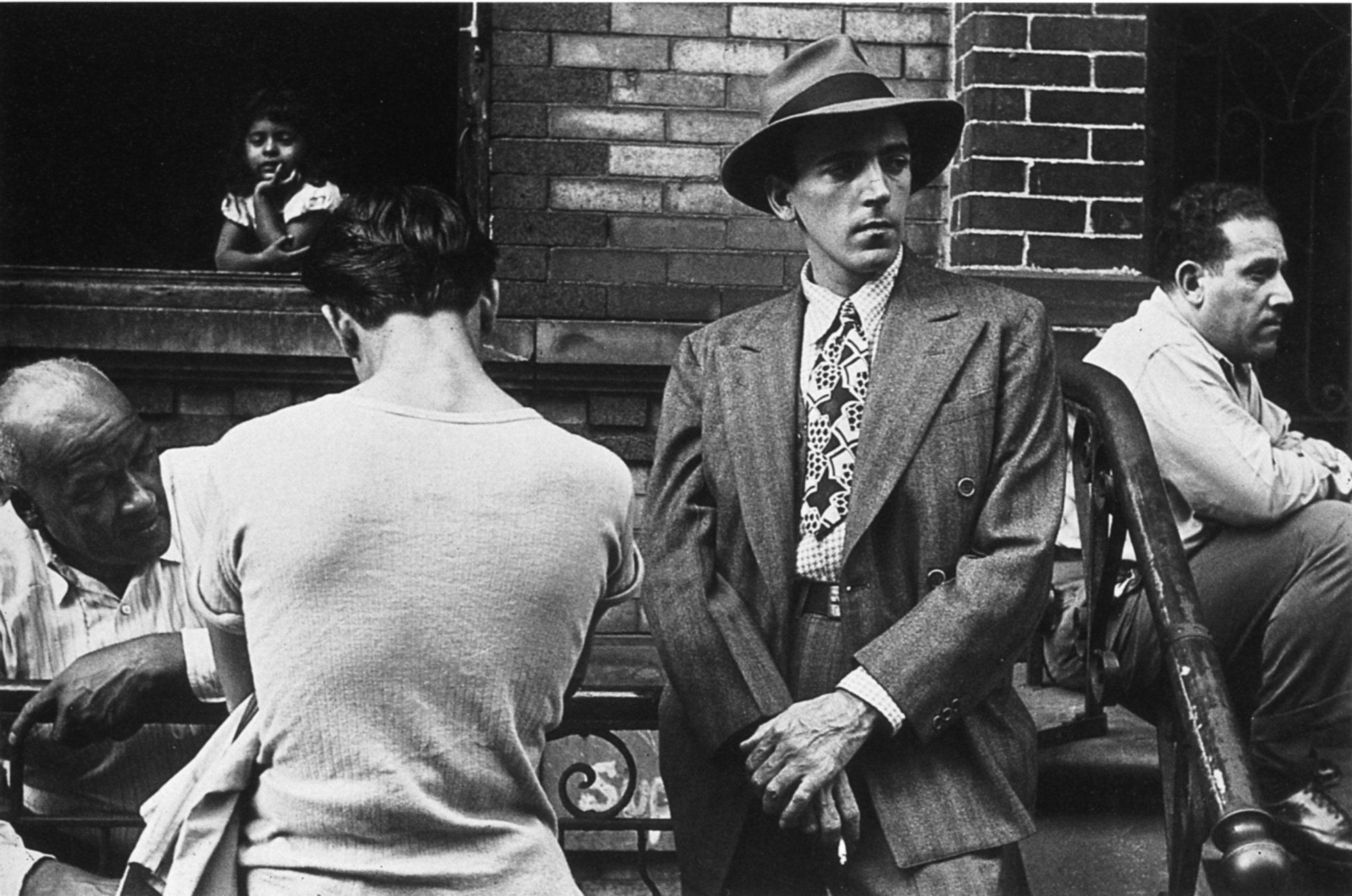
The men in the foreground of this photograph by Helen Levitt bear a visual relationship not only to each other, but also to the lines of the frame. The frame energizes the space around the figures. These formal qualities unite the disparate action of this picture, the seated man with his stolid stare, the languid dialogue of the two on the left, and the streetwise angularity of the central figure, into the jazzy cohesion of 1940s New York City street life.
For some pictures the frame acts passively. It is where the picture ends. The structure of the picture begins within the image and works its way out to the frame.
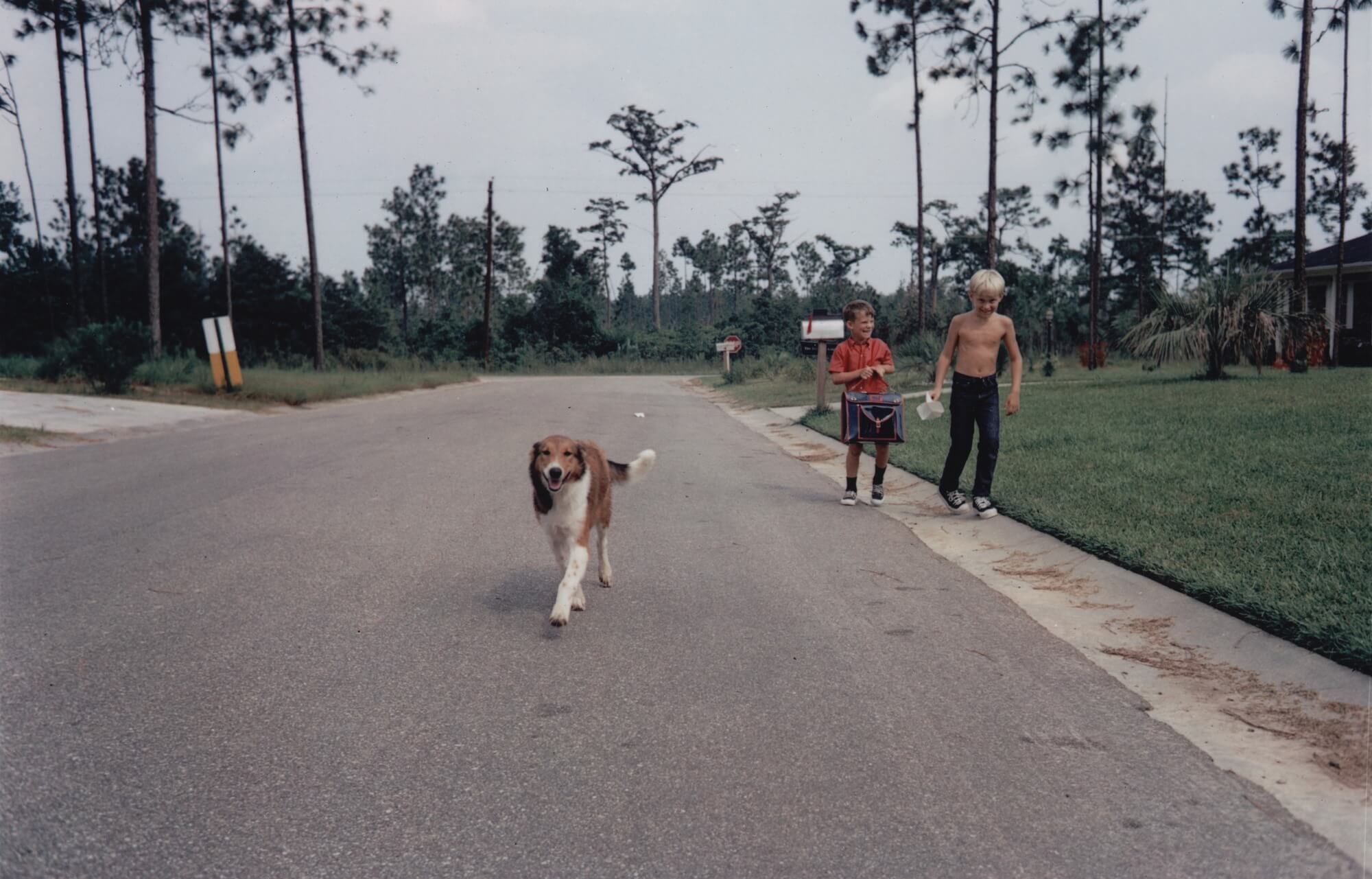
As the street in this photograph by William Eggleston leads to a pine wood beyond the sub-division’s boundaries, so the photograph’s structure implies a world continuing beyond its edges.
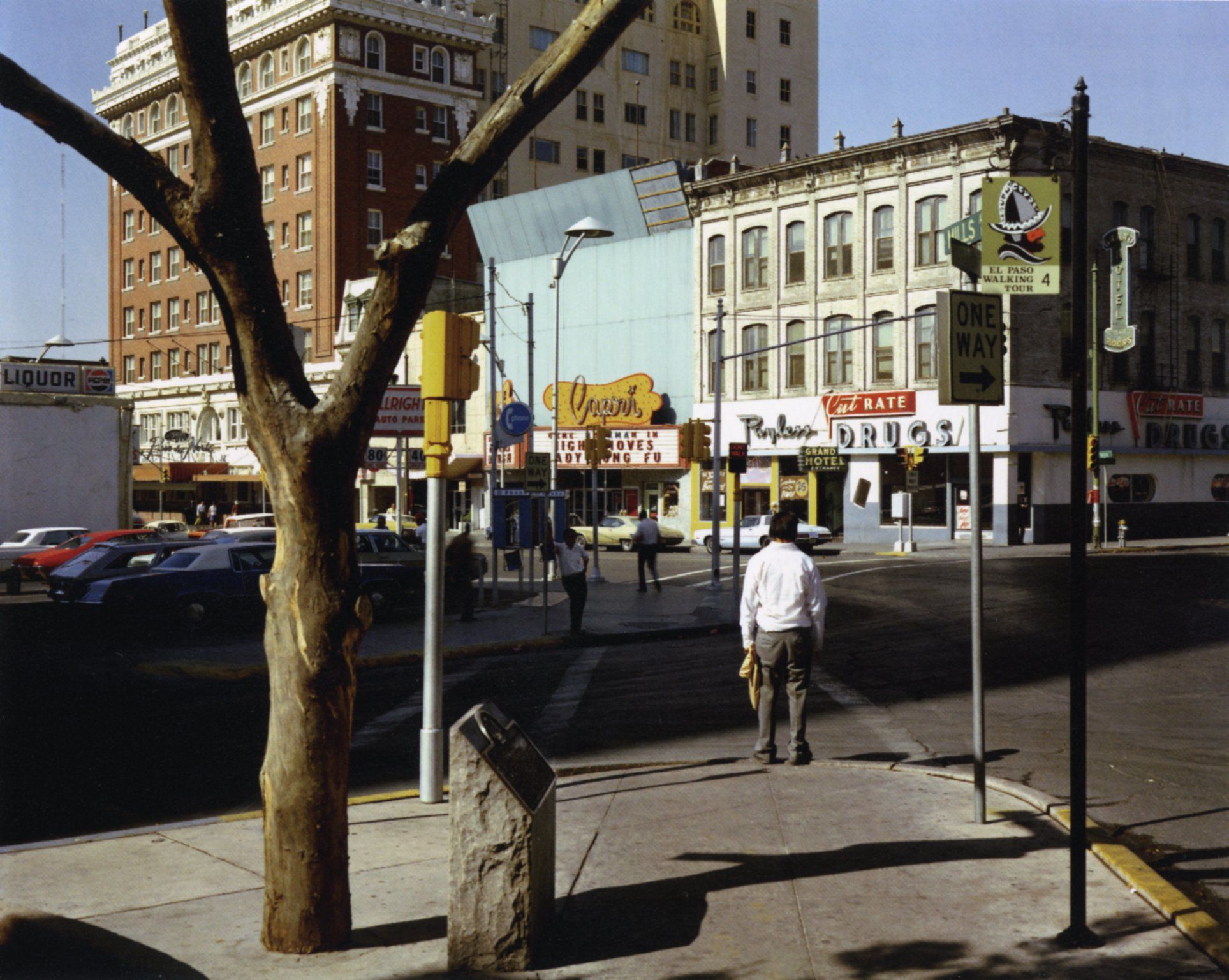
For some pictures the frame is active. The structure of the picture begins with the frame and works inward. While we know that the buildings, sidewalks, and sky continue beyond the edges of this urban landscape, the world of the photograph is contained within the frame. It is not a fragment of a larger world.
Japanese woodblock prints use the frame in a way that is more reminiscent of photographs than of Western painting. It has been suggested that this was a result of the Eastern scroll tradition — seeing the infinitely variable croppings that occur when viewing a scroll as it is rolled from hand to hand. Perhaps by examining what gives these prints their sense of photographic framing we can clarify what photographic framing is.
Notice how, in the upper right of the picture, the frame gives emphasis to the angel’s hand staying the sword. The angel is described with the greatest economy: the artist has given the least information needed for us to read this being as an angel. There is something slyly wonderful about our ability to make an interpretation based on this minimal description.
Now, notice the leg jutting into the image from the lower right. It is really amazing that the artist chose to add this. It doesn’t relate to any of the action in the picture. It is entirely extraneous. It typifies the sort of seemingly arbitrary cropping that occurs when the frame of a photograph slices through the world. While it doesn’t relate to the unfolding drama of the picture, it does imply that this drama is a part of a larger world.

Someone saying ’cheese’ when having a portrait made acknowledges uncon- sciously the way time is transformed in a photograph. A photograph is static, but the world flows in time. As this flow is interrupted by the photograph, a new meaning, a photographic meaning, is delineated. The reality is a person saying ’cheese’. The camera, bearing mute witness, depicts a person smiling — perhaps a shallow, lifeless smile like one in a yearbook portrait or a ribbon-cutting ceremony, but a smile nonetheless. Say ’crackers’ and the camera will see a sneer.
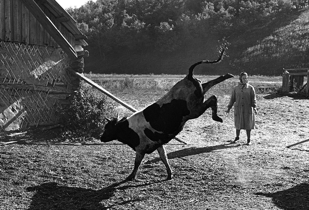
At the Texas State Fair, one day in 1964, a steer was swinging his head back and forth and flicking his tongue. His handler was ducking, trying to avoid the beast. Amid the flux of all this motion, there was one instant, one two hundred and fiftieth of a second, when, seen from a single vantage point and recorded on a static piece of film, the steer’s tongue and the brim of his handler’s Stetson met in perfect symmetry; an instant that, as quickly as it arose, dissolved back into disorder.
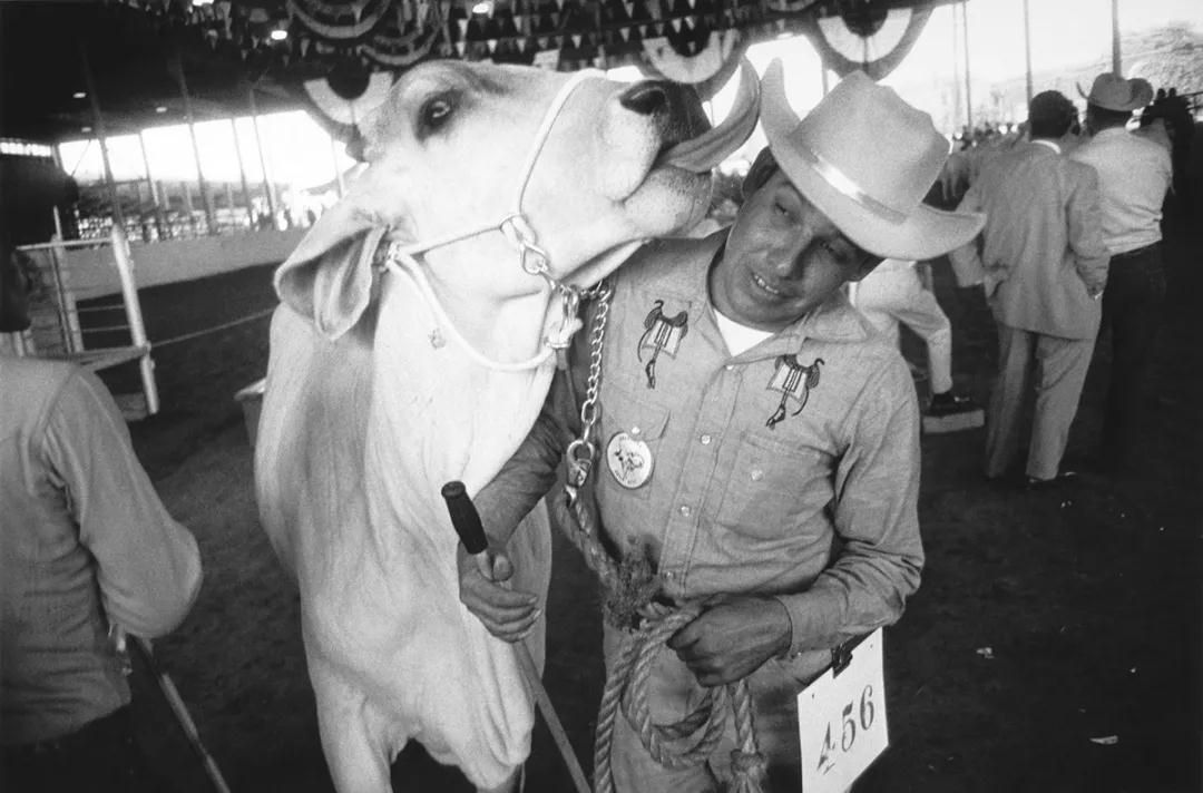
Two factors affect time in a photograph: the duration of the exposure and the staticness of the final image. Just as a three-dimensional world is transformed when it is projected on to a flat piece of film, so a fluid world is transformed. when it is projected on to a static piece of film. The exposure has a duration, what John Szarkowski in The Photographer’s Eye called ’a discrete parcel of time’. The duration of the exposure could be...
one ten thousandth of a second...
Frozen time: an exposure of short duration, cutting across the grain of time, generating a new moment.
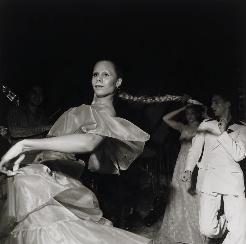
or two seconds.
Extrusive time: the movement occurring in front of the camera, or movement of the camera itself, accumulating on the film, producing a blur.
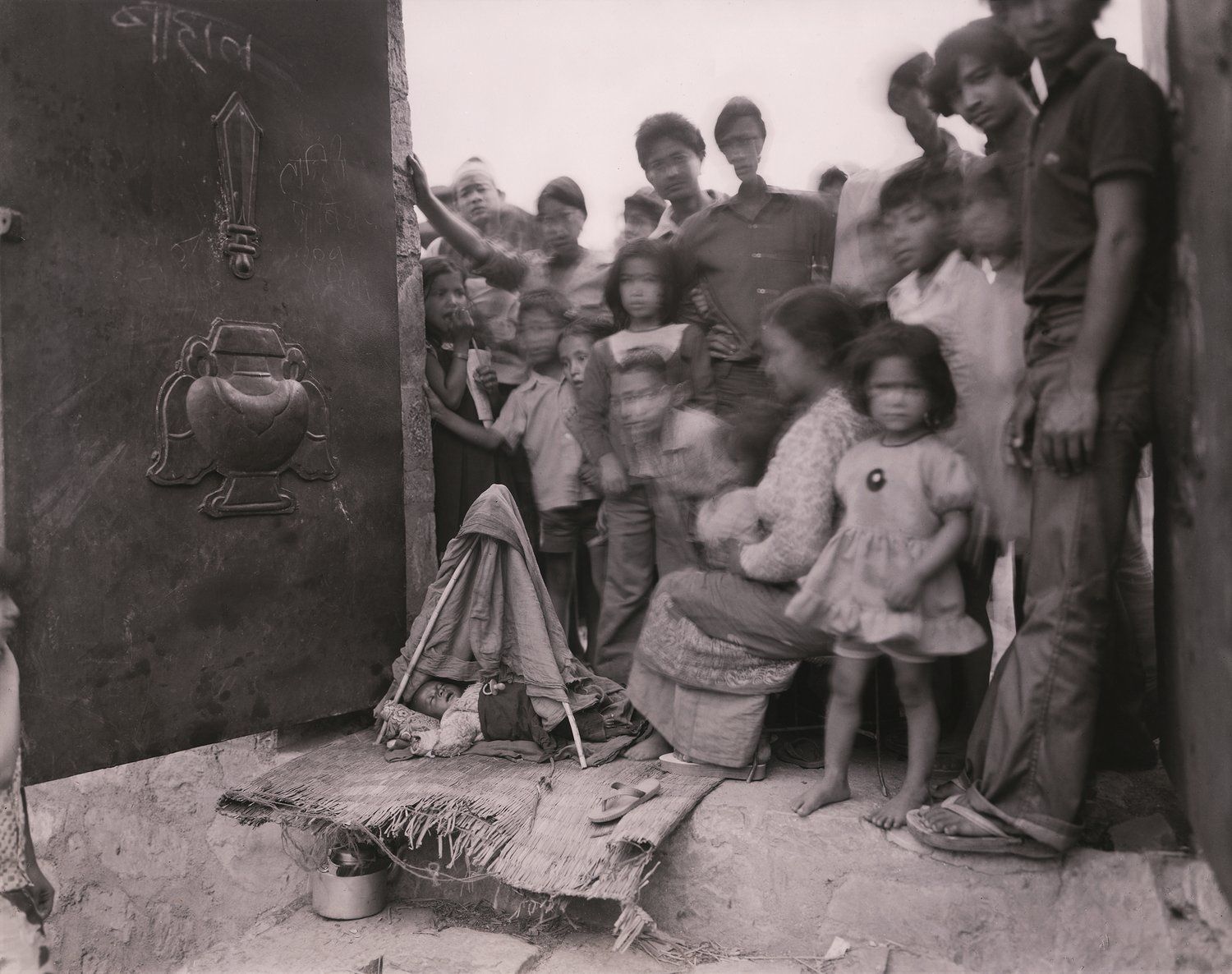
or six minutes.
Still time: the content is at rest and time is still.
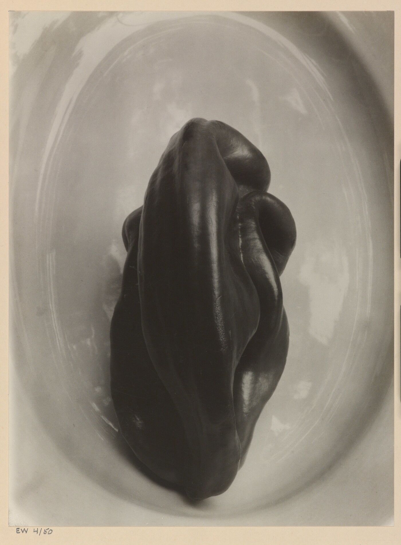
Focus is the fourth major transformation of the world into a photograph. Not only does a camera see monocularly from a definite vantage point; it also creates a hierarchy in the depictive space by defining a single plane of focus. This plane, which is usually parallel with the picture plane, gives emphasis to part of the picture and helps to distil a photograph’s subject from its content.
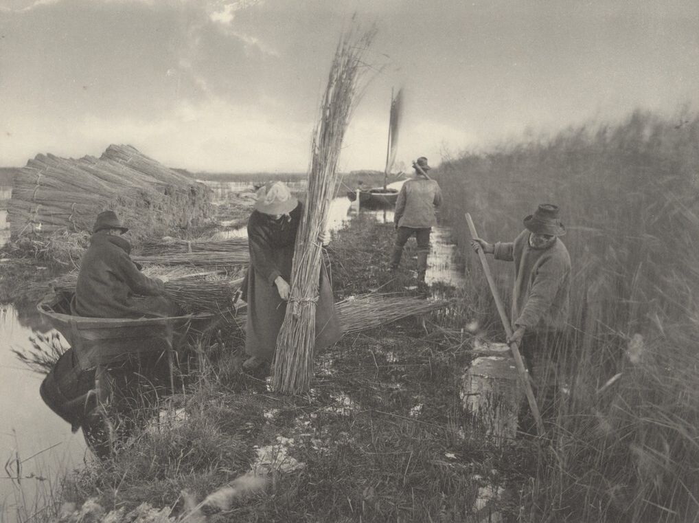
In this photograph by P. H. Emerson, the shallow area in focus — the image’s depth of field — draws the viewer’s awareness immediately to the three reed harvesters in the foreground. It isolates them from the fourth harvester and from the marshes in the background. The plane of focus acts as the edge of our attention cutting through the scene.
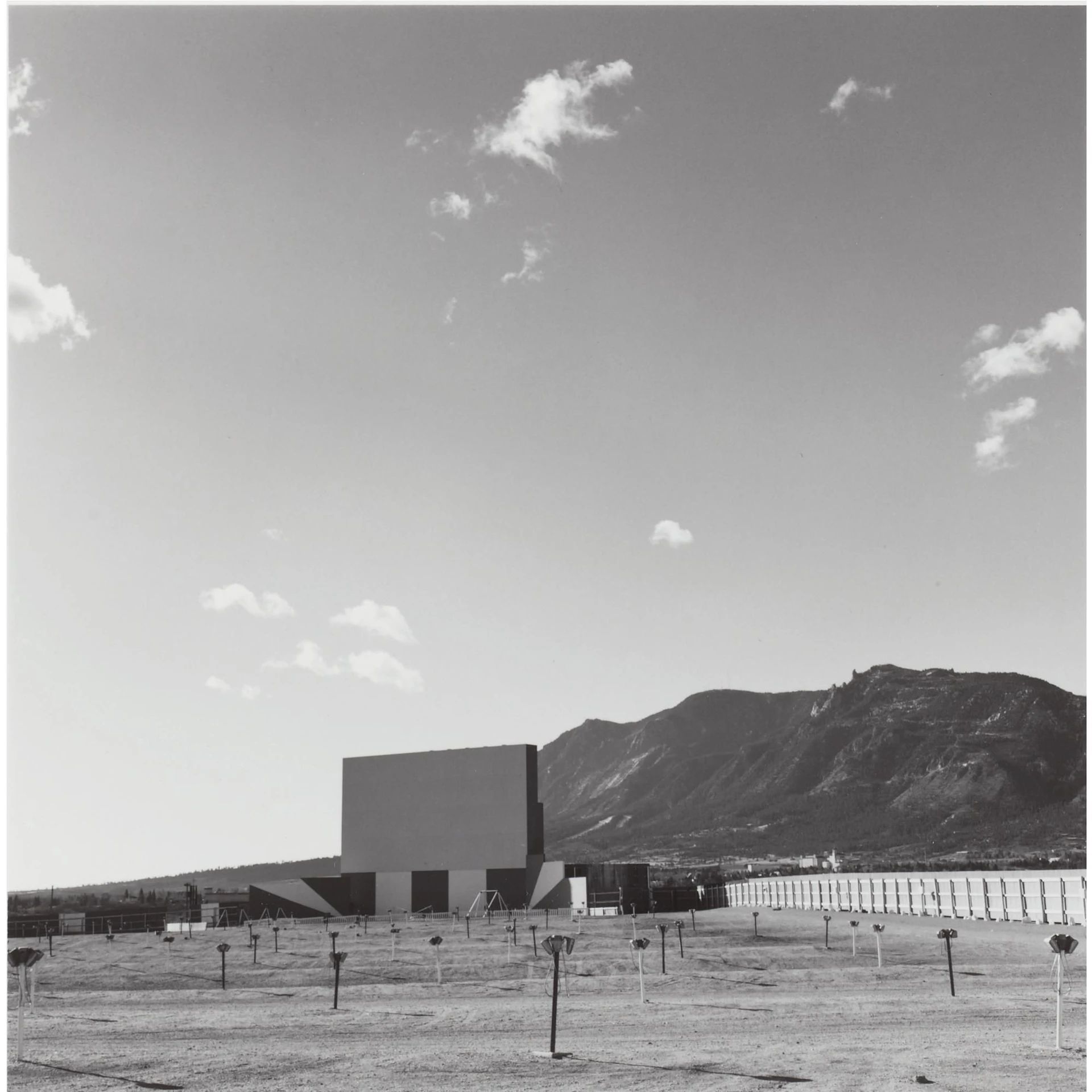
Examine this photograph by Robert Adams. Move your attention from the bottom edge, back through the parking lot, to the movie screen. From the screen, move your attention to the mountain to its right and from there to the sky.
Follow the same path through the picture, but now be aware that as your eye moves back through the parking lot as your attention recedes through the depictive space you have a sensation of changing focus, your eyes focusing progressively further away.
Notice that as your attention moves from the screen to the mountain there is little or no change of focus.
Notice that as your attention moves from the mountain to the sky there is a shift of focus, but now, instead of moving back, your focus is seemingly moving forward, coming closer.
Notice that the direction and speed of your refocusing is not tied to the recession in depictive space. The clouds may be further away than the movie screen, but your focus moves closer.
While with most cameras the lens is attached to a rigid camera body and so bears a fixed relationship to the picture plane, with a traditional view camera the lens, which is attached to flexible bellows, can be pivoted sideways or up and down. This allows the plane of focus to be manipulated so that it is no longer parallel to the picture plane. It can even run perpendicular to the picture plane, as in this still life by Jan Groover.

The spatial hierarchy generated by the plane of focus can be eliminated only by photographing a flat subject that is itself parallel to the picture plane.
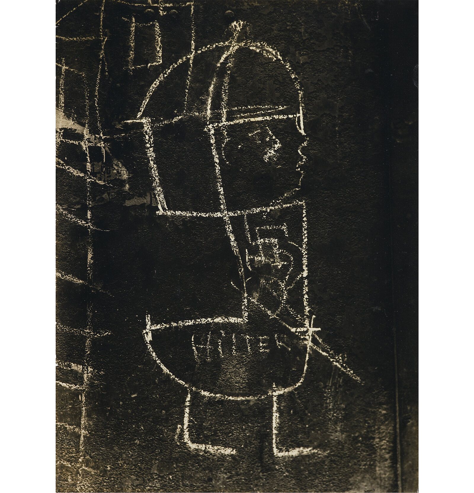
The hierarchical emphasis created by the plane of focus can be minimized by increasing the depth of field. But there is still one plane that is in focus, with space before and behind rendered with diminishing sharpness. There is a gravitation of attention to the plane of focus. Attention to focus concentrates our attention.
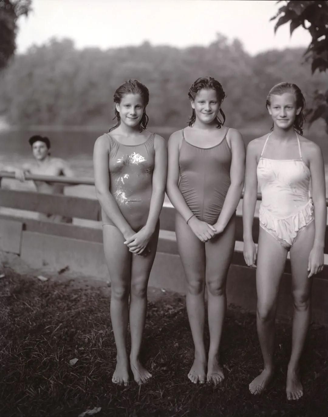
The Mental Level
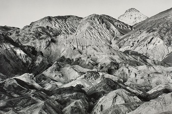
You see a mental image a mental construction when you read this page, or look at a photograph, or see anything else in the world. Your focus even shifts when reading this picture by Paul Caponigro. But your eyes don’t actually refocus (since you are only looking at a flat page). It is your mind that changes focus within your mental image of the picture, with all the attendant sensations of refocusing your eyes. It is your mental focus that is shifting.
Light reflecting off this page is focused by the lenses in your eyes on to your retinas. They send electrical impulses along the optic nerves to your cerebral cortex. There your brain interprets these impulses and constructs a mental image.
This, surprisingly, is an acquired ability. Patients who have had their eyesight restored after having been blind from birth at first see only light. They have to learn how to construct a mental image.
Pictures exist on a mental level that may be coincident with the depictive level what the picture is showing- but does not mirror it. The mental level elaborates, refines, and embellishes our perceptions of the depictive level. The mental level of a photograph provides a framework for the mental image we construct of (and for) the picture.
While the mental level is separate from the depictive level, it is honed by formal decisions on that level: choice of vantage point (where exactly to take the picture from), frame (what exactly to include), time (when exactly to release the shutter), and focus (what exactly to emphasize with the plane of focus). By focusing on the black void at the end of this impossibly narrow ally, Thomas Annan draws our mental focus through the confined space of the image. Focus is the bridge between the mental and depictive levels: focus of the lens, focus of the eye, focus of attention, focus of the mind.
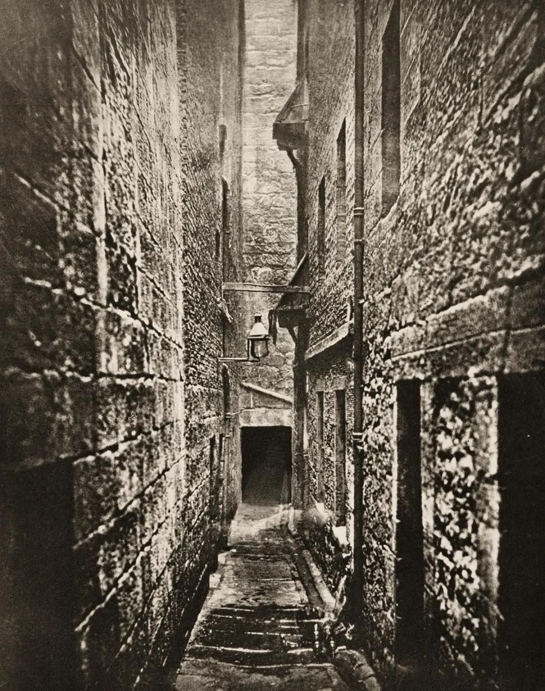
A photograph may have deep depictive space but shallow space on the mental level in which there is little sensation of your eye changing focus.
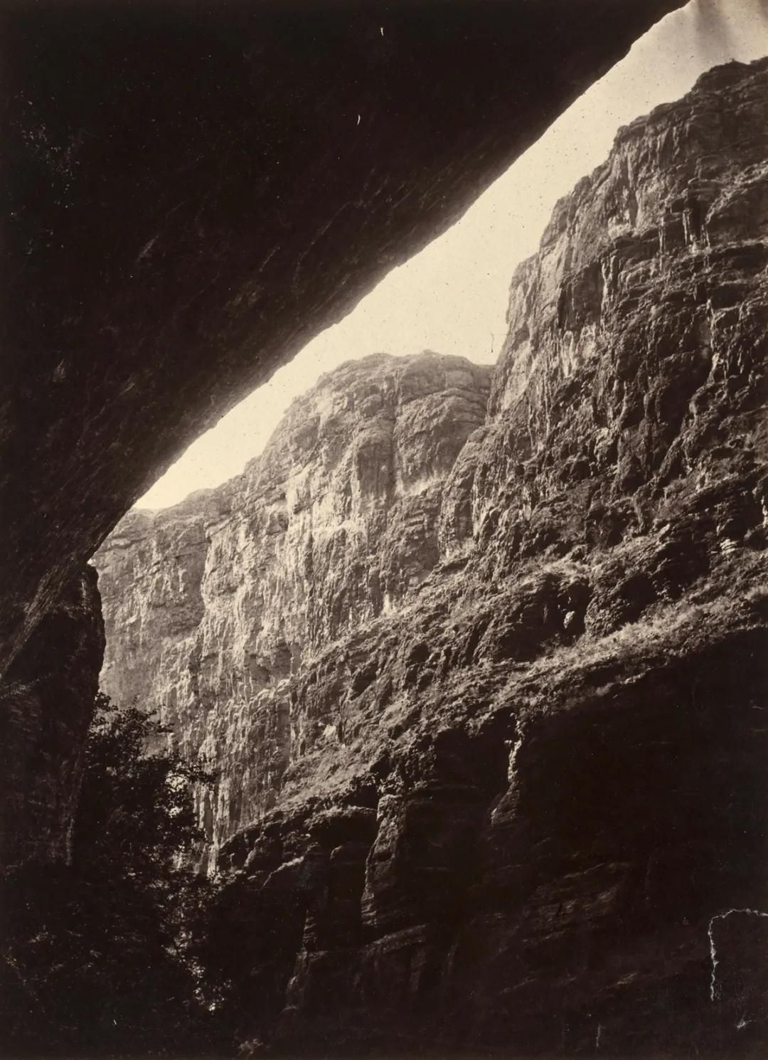
Conversely, a photograph may have shallow depictive space but deep mental space.

A photograph may utilize structural devices to emphasize deep space (layering of planes, receding diagonals, verticals in tension with the edges, etc.) but have shallow mental space.

A photograph may have a relatively inflected structure but have recessive mental space.
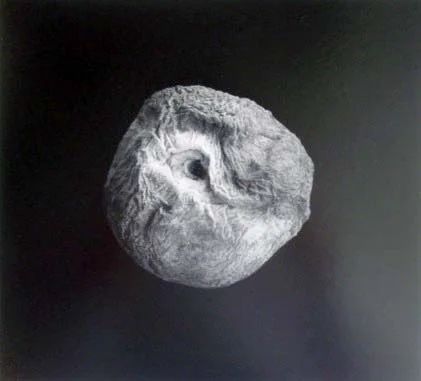
In this Walker Evans photograph track your focus through the space of the picture.
Look at the sky in relation to the rest of the picture.
Unlike the Adams photograph of the drive-in theatre where the sky moved forward, the sky here appears to float on a different plane, as though it were cut out from a different picture, as though it were a collage. This collaging appears when there is a difference in the degree of attention a photographer pays to different parts of the picture. For this to happen, the photographer needs to pay intense, clear, heightened attention to one part of the picture, but not to another.

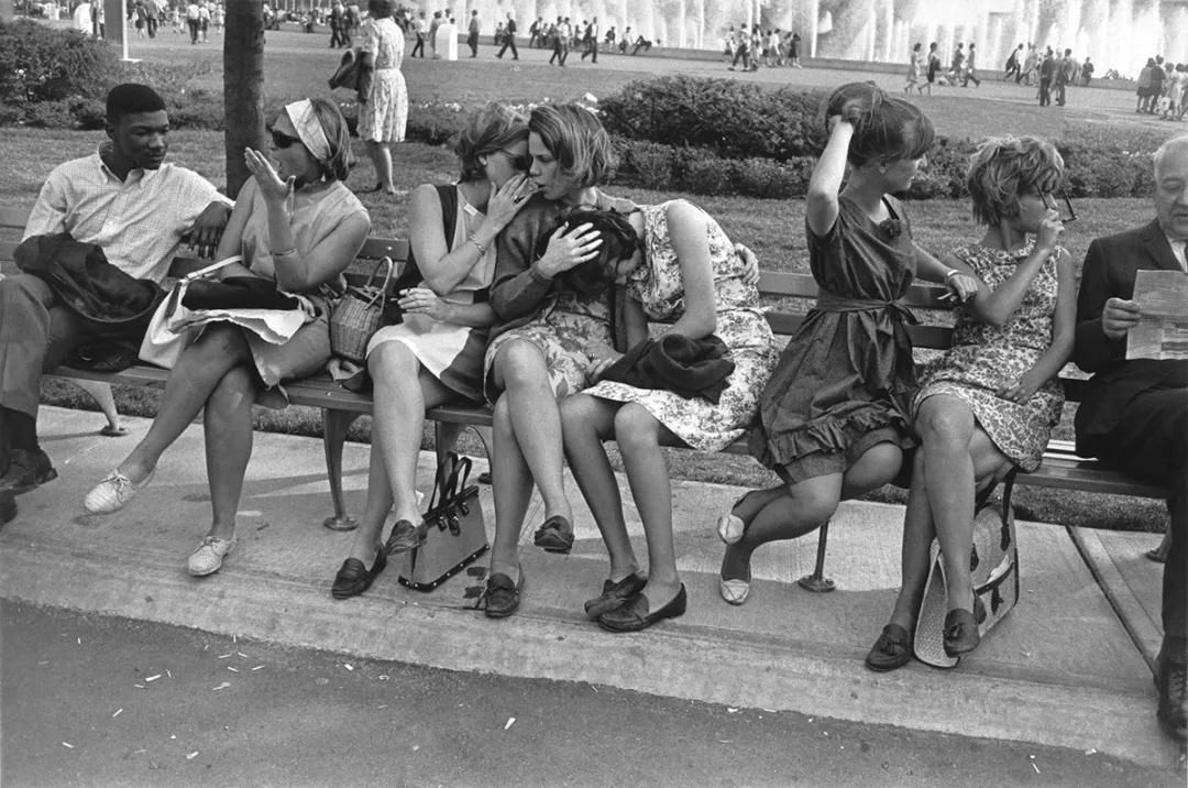
The crystalline clarity of Garry Winogrand’s awareness of a photograph cutting through motion and time makes this image of people interacting on a bench absolutely riveting. The quality and intensity of a photographer’s attention leave their imprint on the mental level of the photograph. This does not happen by magic.
A photographer’s basic formal tools for defining the content and organization of a picture are vantage point, frame, focus, and time. What a photographer pays attention to governs these decisions (be they conscious, intuitive, or auto- matic). These decisions resonate with the clarity of the photographer’s attention. They conform to the photographer’s mental organization — the visual gestalt — of the picture.
If you right now become aware of the space between yourself and this page, there is a transmutation of your attention and perception. This sort of perceptual change — this modification of the mental image would, for a photographer, lead to a realignment of his or her formal decisions in making a photograph.
Mental modelling
The mental level’s genesis is in the photographer’s mental organization of the photograph. When photographers take pictures, they hold mental models in their minds; models that are the result of the proddings of insight, conditioning, and comprehension of the world.
At one extreme, the model is rigid and ossified, bound by an accumulation of its conditioning: a photographer recognizes only subjects that fit the model, or structures pictures only in accordance with the model. A rudimentary example of this is a mental filter that permits only sunsets to pass through. At the other extreme, the model is supple and fluid, readily accommodating and adjusting to new perceptions.
For most photographers, the model operates unconsciously. But, by making the model conscious, the photographer brings it and the mental level of the photograph under his or her control.
Earlier I suggested that you become aware of the space between you and the page in this book. That caused an alteration of your mental model. You can add to this awareness by being mindful, right now, of yourself sitting in your chair, its back pressing against your spine. To this you can add an awareness of the sounds in your room. And all the while, as your awareness is shifting and your mental model is metamorphosing, you are reading this book, seeing these words these words, which are only ink on paper, the ink depicting a series of funny little symbols whose meaning is conveyed on the mental level. And all the while, as your framework of understanding shifts, you continue to read and to contemplate the nature of photographs.
Each level of a photograph is determined by attributes of the previous level. The print provides the physical framework for the visual parameters of the photographic image. The formal decisions, which themselves are a product of the nature of that image, are the tools the mental model uses to impress itself upon the picture. Each level provides the foundation the next level builds upon. At the same time, each reflects back, enlarging the scope and meaning of the one on which it rests. The mental level provides counterpoint to the depictive theme. The photographic image turns a piece of paper into a seductive illusion or a moment of truth and beauty.
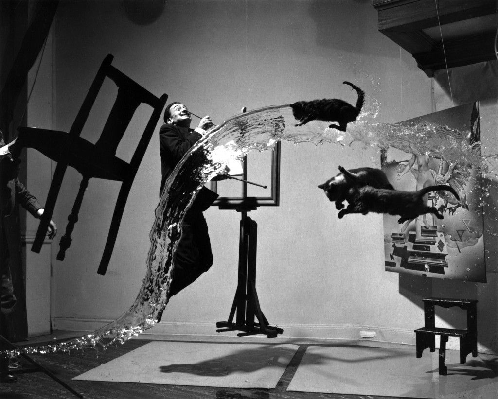
When I make a photograph, my perceptions feed into my mental
model. My model adjusts to accommodate my perceptions (leading me to change my photographic decisions). This modelling adjustment alters, in turn, my perceptions. And so on. It is a dynamic, self-modifying process. It is what an engineer would call a feedback loop.






.jpg)
.jpg)
.jpg)
